This text is part of the Typography course at Eötvös Loránd University. You are free to reuse it, but please refer to this page as its source. Péter Szigetvári
This page contains some rare symbols which may not show on some devices. If you do not see red symbols here [
Writing language at first meant only writing letters, without any punctuation marks whatsoever. The following picture shows a Greek inscription in which words are not written separately, the letters follow each other without any interruption.
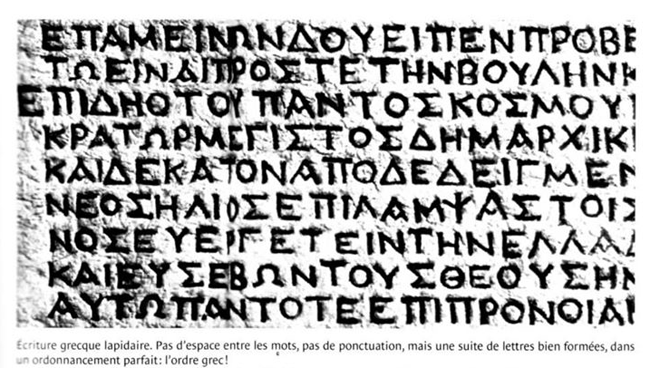
This kind of writing is called scriptio continua (do we need a translation? ‘continuous script’). It has no punctuation whatsoever. Today we would find it rather difficult to read, because we do not really perceive individual letters when we read, but the overall shapes of whole words.
The first punctuation mark that developed in European writing was the interpunct, a raised dot (or triangle, since most of what survives was carved in stone with a wedge-shaped chisel). This was inserted between words. The following is a Roman inscription showing interpuncts. (You may need to enlarge the picture to see the interpuncts.)
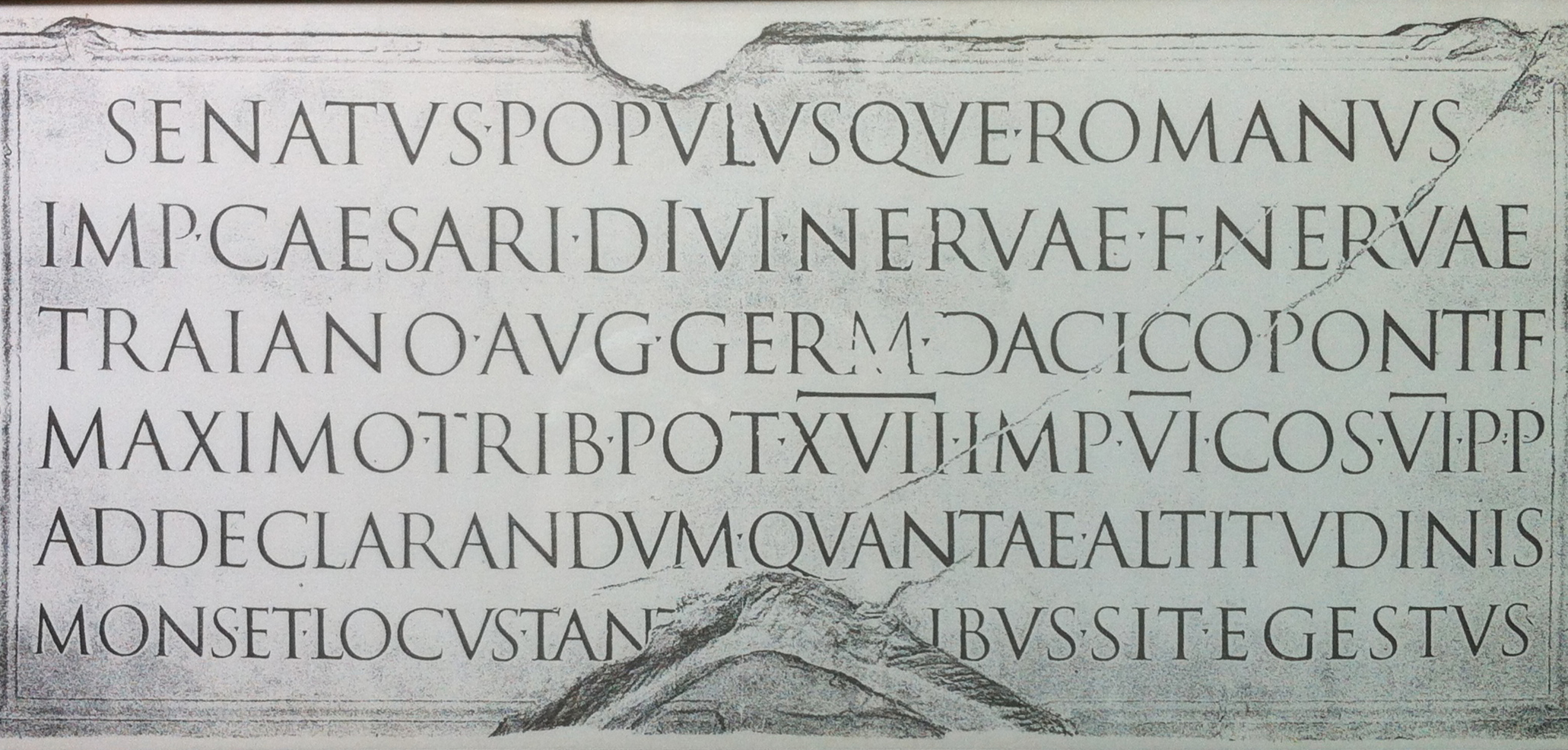
For an extensive background on the interpunct, you may check its Wikipedia page.
The interpunct gave way to (empty) space in current typography, but it is revived in word processors. To see or hide characters that won’t print, you can press the paragraph symbol (¶) in the menu. In the screenshot below, nonprinting characters are shown, including the blue interpuncts between words. Also notice the ¶ at the end of the line, marking the (current) end of the paragraph.

During the development of European writing further punctuation marks have developed. We will look at the more common ones categorized by their uses.
At the end of a sentence we regularly find one of three punctuation marks. By far the most common one is the full stop (also called period by Americans). Sentences may also end with the exclamation mark or the question mark.
Besides ending sentences, we may also find a full stop at the end of abbreviations, like Mr., cont., etc. In many cases, especially in British publications, the abbreviation-final full stop is missing: e.g., (or eg) Mr Adams vs Mr. Adams, J R R Tolkien vs J. R. R. Tolkien.
A recent use of the full stop is to separate words in email or web addresses, where spaces are not allowed or not advised.
The full stop is also used to separate decimal fractions in numbers in the Anglo-Saxon convention: π=3.14159265. (The continental convention is to use a comma here: π=3,14159265, while an earlier British practice was the use of the interpunct in this context: π=3·14159265.) The full stop separates thousands and millions in the continental tradition: 42.195.000mm. (The Anglo-Saxon convention here is using a comma: 42,195,000mm.)
The exclamation mark (or point, sometimes called screamer or bang) is allegedly a schematized form of the Latin exclamation io ‘hurray’, with the ‘I’ positioned over the ‘o’.
When not sentence final, an exclamation mark is usually in parentheses. In this case it is used to point out something surprising, with emphasis on the word before it: She has seven(!) cats.
The exclamation mark is used for several other purposes, it may represent factorial, negation, or calling attention to something, especially danger: ⚠️.
The question mark derives from a capital ‘Q’ and an ‘o’, the first and last letters of Latin quæstio ‘question’. It may occur within a sentence too: Where do we come from? where do we go? and why?
Some questions have a peculiar intonation. To prepare the reader for this, a Spanish and Catalan convention adds an upside down question mark (and exclamation mark) at the beginning of a sentence too: ¿Qué hora es?, ¡Olé!
Both the exclamation mark and the question mark can be emphasized by tripling them: Excellent!!! Really??? The latter could also be spelled as Really!? There even exists a punctuation mark, called interrobang for this combination: Really‽ These symbols, however, should not be overused. Do not use more than three of them in a row.
There are also punctuation marks that occur within a sentence, usually, though not exclusively at the end of a clause.
The most common punctuation mark in this category is the comma. It separates clauses, thousands in the Anglo-Saxon tradition and decimal fractions in the continental tradition, as explained above.
Commas are also used in lists containing more than two items. There are two conventions in the punctuation of such lists, as shown below:
The second comma in example 2, printed in red, is a serial comma (also known as Oxford or Harvard comma). The necessity of this comma is the subject of utterly useless, but heated debates, a recent example of which is the one about the 50p Brexit coin, which does not contain a serial comma.
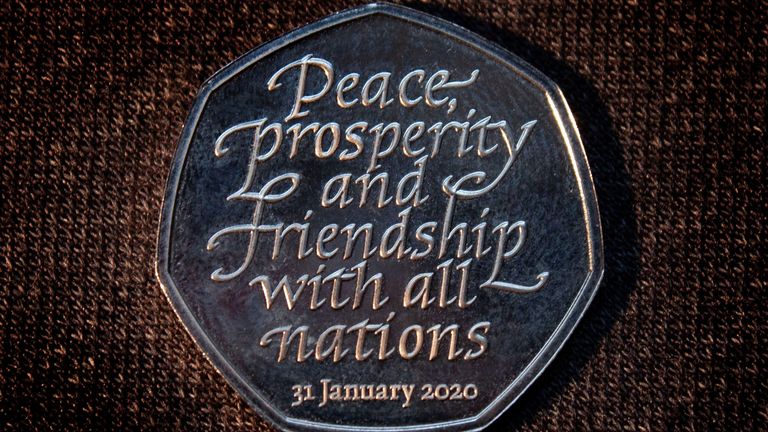
You may want to read Wikipedia on this or this post at Nyest.hu (the latter in Hungarian).
The semicolon is a stronger type of comma. It is not as common as the other punctuation marks mentioned so far. Here’s some advice on its use.
The colon is used for clarification: to explain what has been said before it. A colon is also used to separate hours, minutes, and seconds: The time is 10:15. Yet another use of the colon is to separate a title and a subtitle: Star Wars IV: A New Hope.
Broadly speaking there exist two traditions in connection with spacing around punctuation marks. One of them could be called English spacing, the other French spacing.
In the case of English spacing there is no space before the punctuation marks discussed so far. After all, we would not like a line break to occur before them. English spacing also means a larger break between sentences than between words. This convention continued during the age of typewriting as a single space between words and double space after a sentence-final full stop, a colon, or a semicolon. This is exemplified below, with red interpuncts to make spaces visible.
Here
French spacing is different from English spacing in two respects. On the one hand, the space separating sentences is the same size as that separating words. On the other, there is a space, thinner than normal and nonbreaking before ‘tall’ punctuation marks, that is, the colon, the semicolon, the exclamation mark, and the question mark, as well as on the ‘wrong’ side of the guillemets (more on which below). Here’s a sample from a French book.
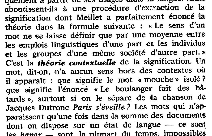
The most widespread current practice is not to have any space before punctuation marks (as in ‘English’ spacing) and not to distinguish the space between sentences and words (as in ‘French’ spacing). To complicate things a bit further, since larger intersentence space is considered elegant and ‘French’ is often used for things elegant, English spacing is sometimes referred to as ‘French’ spacing.
One advantage of leaving a wider space after a sentence, that is, typing two spaces after a sentence (and only one between words within a sentence), is that this clearly distinguishes a sentence-final full stop from one ending an abbreviation.
If you are interested in further details, check out the relevant Wikipedia articles on sentence spacing and on its history.
The use of typewriters and later computer keyboards blurred the difference between different dashes used in carefully typeset texts. We will here distinguish between the four most common types, noting that there are other, less frequently used ones too.
The hyphen has two functions: to join and to separate. The parts of compound words are sometimes joined by a hyphen: a well-known joke, twentieth-century writers. When part of a compound is ellipted, we may use a suspended hyphen: nineteenth
Hyphens are also used to split words across lines. To disambiguate the two functions of the hyphen, some publishers use the old-fashioned glyph (shape), ‘⸗’. Thus they have well⸗known, but disam- // biguate. (Imagine a line break at the two slashes.) Others only have it in compounds split between lines:
The minus sign is usually wider than the hyphen, it is the same size as the horizontal bar of the plus sign (‘+’). It is always horizontal (unlike the hyphen in the font of this documet, EB Garamond, for example). It is used for subtraction and before negative numbers:
3 − 5 = −2 (cf. the unprofessional 3 - 5 = -2)
The en-dash is 1en wide (1en is 0.5em, it is the width of the letter ‘n’, an em is the width of the letter ‘m’ in a proportional font). The en-dash is used for ranges, especially between numbers: pages 18–23, 10am–1pm, or relations: Dutch–English dictionary, Paris–Dakar Rally.
Note the difference between the following:
There are no spaces around the en-dash, and if you look close enough, the glyphs are also different.
The em-dash is 1em wide, as its name suggests. Its typical use is to delimit parenthetical material, and so it often comes in pairs: Looking after cats — a noble task — needs patience.
For comparison, here are the four symbols in the order discussed: hyphen, minus sign, en-dash, and em-dash:
- − – —
It is not easy to distinguish the minus sign and the en-dash. The minus sign is often (though not always) further away from the baseline, since it aligns with numerals which are often (though not always) taller than most lower case letters.
The following chart contains the Unicode codes and the HTML entities for these dashes.
| symbol | name | Unicode | HTML |
|---|---|---|---|
| − | MINUS SIGN | 0x2212 | − |
| – | EN DASH | 0x2013 | – |
| — | EM DASH | 0x2014 | — |
There are practices of using only the en-dash or only the em-dash symbol. The two functions are distinguished by adding spaces only around the em-dash, not the en-dash function, as shown below:
only en-dash glyph: He read pages 18–23 in the book – which turned out to be important.
only em-dash glyph: He read pages 18—23 in the book — which turned out to be important.
When the en- and em-dash symbols are not available, they can be replaced by two and three hyphens, respectively:
pages 18--23 in the book --- which…
In fact, many word processors automatically replace (or can be instructed to replace) two hyphens by an en-dash and three by an em-dash.
Brackets come in various styles, we here discuss the four most common ones, shown below. Typewriters do not have all these different brackets, but computer keyboards do, because they play an important role in coding. (Check out, for example, regular expressions.)
Rarely, embedded brackets follow each other in the order above: so we have (parentheses first [brackets inside {then braces}]). It is more common, however to simply have parentheses inside parentheses inside parentheses. In mathematics embedding is indicated by different sized parentheses: 2 ( ( 0.5 ( x − 3 ) ) + y ).
Parentheses (this is a plural form, since these symbols come in pairs, the singular is parenthesis) are mainly used for enclosing bits of the text that are less relevant, or do not relate to the main point directly.
In schools some teachers advise pupils to enclose (misda) mistaken text in parentheses. This is not a good idea, since parentheses have other functions. This practice makes sense in handwriting only, of course. It has become common in electronic texts to indicate this by crossing out striking through the letters. This effect is also used humorously, as if the text was censored: ‘I take no responsibility’ said the bully Mr Trump.
(Square) brackets are often used in quotes to supply letters/words that were not there in the original text: “I […] don’t see it [the cat].” Funnily, classical philologists use brackets for deleted text: “cum Cæsar[e] venit” means that the manuscript contains Cæsare, but it should rather read Cæsar.
Brackets are also used to enclose narrow, phonetic transcription, rather than broad, phonological transcription.
We here mention two common uses for braces: (i) to enclose a set, as in line 1 below and (ii) to show disjuction, an either/or choice, as in line 2.
We here mention two common uses for angle brackets. They can be used to mark spelled forms of words, as in line 1 below. Classical philologists use it for inserted text, as in line 2.
Angle brackets are often replaced by the somewhat similar ‘less than’ and ‘greater than’ symbols: <bare>.
In order to avoid bad line breaks, the convention is to type a space before an opening bracket but not after it, and after a closing bracket but not before it.
text
Like brackets, most quote marks also come in pairs, with an opening and a closing version. Nevertheless, computer keyboards have only three quote characters, a single (') and a double quote ("), and the backtick (`). (The single quote mark is also used as the apostrophe, more on which below.) Using these characters we get:
The quotes in lines 1 and 2 above are undirected or dumb quotes. (The quotes in line 3 are directed, but ugly.) In properly typeset texts, we find directed or smart quotes, as below:
“double quotes”
‘single quotes’
You can get smart quotes in your text in two ways. One is to let the computer do it by setting Custom quotes in AutoCorrect options in a word processor. If you then type dumb quotes, they will automatically be replaced by smart ones.
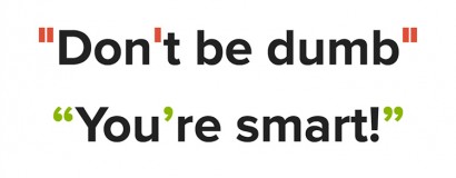
This works in most cases, but apostrophes can be misinterpreted: in the '90s will become in the
Quote marks are apparently the most varied of all punctuation marks at an international level. We basically have the same two symbols, ‹ and ‘ (which, in fact, are two differently stylized varieties of the same mark), pointing in two directions (left and right). The angled variety is typically in the middle of the line, the rounded one can be located in two positions (on the baseline, at raised to the top of the line). The result is a plethora of quote marks.
Many conventions distinguish between two types of quote marks, primary and secondary, the latter used for quotes inside quotes.
English texts have two conventions, one more typical of American publications (“primary”, ‘secondary’), this is shown in 1 below, the other, primarily British, convention is more recent (‘primary’, “secondary”), this is shown in 2:
One advantage of the “American” convention is that it allows less room for confusing the quote mark with the apostrophe. Meanings of words/phrases/sentences are always given in single quotes.
The German convention is to open quotes with the English closing quote marks but on the baseline and to close them with the English opening quotes.
„HAL sagte: ,Guten Morgen, Dave‘“, erinnerte sich Frank.
The French convention does not distinguish “outer” and “inner” quotes. The French quote marks are called guillemets, they are small double chevrons As mentioned above, quote marks are surrounded by a space on both sides in French spacing. (The space on the “wrong” side is, of course, a nonbreaking space.)
« HAL a dit, « bonjour Dave » », a rappelé Frank.
The Swiss tradition has single inner quotes:
«HAL a dit, ‹bonjour Dave›», a rappelé Frank.
«HAL sagte: ‹Guten Morgen, Dave›», erinnerte sich Frank.
Pre-WW2 Hungarian texts have followed the German convention, but later the closing quotes were changed to the English style. Secondary quotes are guillemets, but their order is the opposite as in French.
„HAL azt mondta: »Jó reggelt, Dave«”, emlékezett Frank.
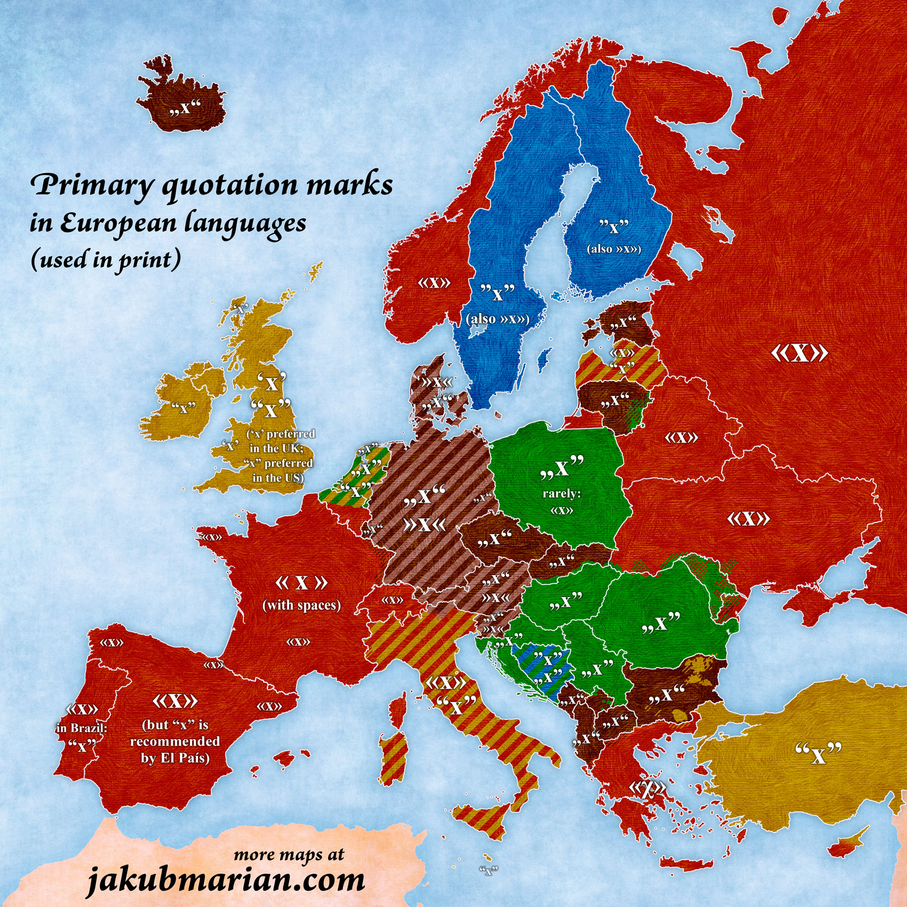 source: Jakub Marian
If you’re interested in still further details (and speak Hungarian), you may want to read this post on Nyest.hu. Wikipedia has an extensive list of national conventions. Check here for Unicode codes.
We end this list with some punctuation marks that do not fit in the above categories.
The glyph of the apostrophe is the same as that of an English type single closing quote. It functions totally differently. Like all quote marks, the single quotes occur in pairs. Apostrophes, on the other hand, are loners.
Apostrophes mark the omission of letters (or numbers). For example, an o is omitted in couldn’t (in spelling, not in pronunciation) and 19 is omitted in the ’90s. The apostrophe in so-called Saxon possessives (like the queen’s crown) also used to mark the omission of a historical e.
The prime mark looks similar to the apostrophe, but it has different functions and it is not curved. It marks a variable that is similar to another one: a′ is similar to a. The prime symbol also used to abbreviate a unit of length, the foot (2′ means ‘two feet’) and also the arcminute (one sixtieth of a degree: the ELTE campus is about 19°3′ east of Greenwich).
The double prime mark is two prime marks, representing inches, or arcseconds: a fathom is about 6′1″, the ELTE campus is about 47°29′40″ north of the equator.
Strictly speaking, the prime and the double prime mark, like the degree symbol, °, are not punctuation marks, but symbols similar to, for example, the dollar sign, $, or the percent sign, %. We discuss them here only because of their similarity to the apostrophe (and the single closing quote mark).
The ellipsis dots look like three consecutive full stops, and most people actually type them so. However, it is a separate symbol. In many proportional fonts the ellipsis dots are further away from each other than three full stops. In a monospace font they are squeezed together, since they must take up as much space as any other character: … vs ...
The slash is also called oblique, virgule, slant, or diagonal separatrix. It indicates alternatives (he/she), or juncture (bee/mosquito protection). In English texts it also is used in abbreviations: c/o ‘care of ’, w/o ‘without’. Again, you may satisfy your curiosity by looking up further details.
You may recall that typography is governed by some basic principles, among them the Principle of Logic and the Principle of Esthetics. These two principles can be reconciled in some cases, but will come into conflict in others. A closing parenthesis at the end of a sentence will be before the sentence final punctuation if it refers only to a part of the sentence (like here), but after it if it refers to the whole sentence. (For the latter case, this is an example.)
The Principle of Logic requires proper nesting of paired punctuation marks: close first what was opened last. It also requires that things that belong together should be next to each other. Esthetically, however, it is not desirable to leave the baseline empty. The two principles come into conflict with closing quotes. When only part of a sentence is quoted, the quotes should be closed first by the Principle of Logic: This is a “cat”. But in this case, the baseline is empty under the closing quote mark before the full stop, which is considered ugly. So we often find the “illogical” but “nice” solution: This is a “cat.”
In case of footnote or endnote indexes, the widespread convention prefers the “nice” solution over the “logical” one: the index is always after the punctuation mark: This is a cat,* those are dogs.**
The following video departs at some points from what I just said, but it is linked here because it is much more enjoyable: