 In Polish ó is [u] that comes from an earlier [o], as in Łódź or krówka.
This text is part of the Typography course at Eötvös Loránd University. You are free to reuse it, but please refer to this page as its source. Péter Szigetvári
Diacritics are usually small. To see them well, you may consider reading this text on a larger screen. Also have a look at the slides/handout linked above.
Writing needs letters. Writing in Europe is mostly symbolizing sounds (more precisely phonemes, as you (should) know). Writing in Europe is mostly based on three alphabets, the Greek alphabet and its two derivates, the Roman and the Cyrillic alphabets. The Cyrillic alphabet is extensively used in the eastern part of Europe (to write Russian, Ukrainian, Belorussian, Bulgarian, Macedonian, Serbian), and the Greek alphabet to write Greek. The rest of European languages have adopted the Roman alphabet for writing. (There are some exceptions at the edges of Europe, like Georgian or Armenian, which have their own dedicated alphabets. Turkish has switched to the Roman alphabet less than a century ago. Yiddish used to be spelt with Hebrew letters, but such texts have mostly disappeared after World War II.)
The problem with such a diverse range of spelling systems using the the Roman alphabet is that it was tailored to write Latin. This means there are letters for sounds that Latin had and there are no letters for sounds that Latin did not have. (This is not exactly true, for example, Latin had one [k], but there were three letters for it, C, K, and Q. Also some new letters, like W, or the distinction of I/J and U/V were introduced in the Middle Ages.) There are four common ways to create new letters.
In this chapter, we will discuss the last two sets: diacritics and ligatures.
Diacritic symbols typically do not occur in isolation, rather they are “carried” by a letter, that is, they are placed above, below, across that letter. Here are some examples: á, ƀ, ç, ḍ, ę, ğ, ĥ, ī, ķ, ł, ñ, ò, ř, $, ť, ů, ÿ, ż.
There are two ways of producing a letter with a diacritic mark in a computer. Many such characters are precomposed, that is, they have a number assigned to them, for example, á is 225, that is, hexadecimal 0xE1 (where the prefix “0x” introduces a hexadecimal (base 16) number, E1 in this case; the letters mean numbers above 9, A=10, B=11, … E=14, so E1 is 14×16+1=225; get involved in some geekery).
However, there are many letters and many diacritics, furthermore a letter may carry several diacritics simultaneously (like ą́), so we need very many codes, and there certainly are not enough keys on any keyboard for all of these. It would also be a waste of resources to manufacture a key (say, Ỳ) that you press only when you are writing a typographical note about diacritics, which most people never do.
So there also exist so-called combining diacritics, which are like a normal character, except that they merge with the following character. This is a very versatile method for producing letters with diacritics. The problem is that the result is produced automatically, and is usually far from perfect. Compare a precomposed “á” with an “a” plus a combining diacritic:
precomposed á vs combined á
The first “á” (character 225) above should look okay, but whether the second one is fine or not depends on your device. (It is two characters, 97 and 769, that is,
The pro of a combining diacritic is that it can be put on anything (e.g., ~́) however, the result may not be very nice. So try to use precomposed characters when available. And always look at the result on several devices.
Let us look at some of the more common diacritical marks, what they look like, where they come from, and what they are used for.
Accent marks may mark accent (a.k.a. stress), or the quality, or the quantity of a vowel. Accent marks are perhaps the most common diacritic marks, the term accent is sometimes used synonymously with diacritic.
The acute accent mark tilts right. It is used to mark stress/accent in the spelling of many languages, including Italian, Spanish, Portuguese, and Welsh. It may also indicate the quality of a vowel (e.g., French é is [e], è is [ɛ]), or both stress and quality (Italian, Catalan, Portuguese). In other cases it marks tone (the pitch of the vowel), high (Yoruba) or rising (Vietnamese).  In Polish ó is [u] that comes from an earlier [o], as in Łódź or krówka.
In some spelling systems, it marks length (Irish, Czech, Slovak, Hungarian), even with consonant letters in Slovak: ĺ and ŕ. In other cases it marks the palatalization of consonants (Croatian, Polish): ć, ś, ź.
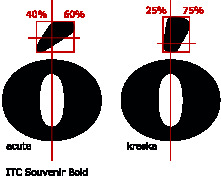 However, Adam Twardoch argues that the palatalization mark on consonants, called kreska in Polish, is not identical to the acute accent, it is less tilted. This, he claims, also influenced the diacritic on the o in Polish, which is thus different from that in other languages. This accent has no nonPolish name, since nobody else notices the difference.
The double acute accent is a Hungarian speciality. The long version of ö and ü is marked by ő and ű. These vowels were earlier represented by ö́ and ǘ (which forces us to illustrate a combining acute accent mark once again).
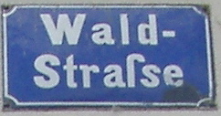
In fact, as the road sign on the right shows, Faroese spelling also sometimes uses ő, though the normal symbol for this vowel is ø. Slovak spelling also occasionally makes use of this diacritic: the long version of ä is a̋.
Like the acute, the grave accent mark (pronounced [ɡraːv]) is also used to mark stress/accent and often vowel quality at the same time. It also shares another function of the acute, marking one, this time low tone or falling tone. Portuguese à indicates the contraction of a a ‘to the-fem’, while French à ‘to’ has an accent simply to distinguish the word from a ‘has’.
Sometimes we find a grave accent mark in English to show that an e is pronounced: e.g., learned [lə́ːnd] vs. learnèd [lə́ːnid].
The caron is commonly used in the spelling of Slavic languages. Other names are often used too: Czech háček, Slovak mäkčeň, Serbocroat kvaka, Slovenian strešica, Lithuanian paukščiukas (most of which incidentally contain it!, also note that Lithuanian is not a Slavic language). The English name caron iteself is fairly recent, probably based on caret, more on which below.
The caron also marks palatalization. Polish or Croatian, which have two types of palatals, have both ć and č.
The caron does not have a uniform shape. Letters that do not have a “plateau” to carry the wedge, are marked with right half of the caron. So the following characters all have a caron: č Č
Czech can also have the caron on e: instead of ďe, ňe, ťe, we have dě, ně, tě, also bě, fě, mě, pě, vě.
The circumflex accent is an inverted caron, it’s alternative name is caret, from Latin ‘it lacks’, since this mark was also used by proofreaders to indicate that something should be inserted in a text.
So this is the caret: ĉ, and this is the caron: č.
The circumflex is often used to mark stress, like the acute and the grave accent marks. In French it often marks the loss of an earlier [s]: Latin costa is French côte ‘coast’, Latin is(u)la is French île ‘isle’, Latin augustus is French août ‘August’, etc, sometimes of other sounds: Latin anima is French âme ‘soul’.
In the spelling of Esperanto, the caret is used like the caron in Slavic: Esperanto ĉ, ŝ is Czech č, š etc.
The macron is the generic length mark. As a tone mark it is used for mid tone.
The dieresis and the umlaut are two different diacritic marks, which have the same form. They come from different sources and mean different things, the two are homographs, so to say.
The dieresis (sometimes spelt diaeresis) [dajérəsis] (also called trema) primarily marks hiatus, the fact that two vowels are pronounced separately, not as a diphthong or a single vowel. So in naïve the two vowel letters do not represent a vowel digraph ([ej] in English or [ɛ] in French), but two separate vowels. We sometimes find examples of this use of the dieresis in English too: in the old-fashioned spelling coöperate, for example, it shows that we have two o’s (hence [kəwópərejt]), not an oo digraph (not [kúwpərejt]). There also was a dieresis in zoölogical garden, but the word was clipped, the dieresis was lost, so we now have zoo [zuw].
In some cases ‘pronounced separately’ means the pronunciation of a vowel after a consonant, not another vowel. For example, the u in French algue [alɡ] ‘alga’ marks that the g is [ɡ], not [ʒ] (cf belge [bɛlʒ] ‘Belgian’). In aigüe [ɛɡy] ‘acute’ the dieresis indicates that the u is pronounced and does not only indicate the “hardness” of the g. Similarly, in the name Brontë the last vowel is pronounced (as opposed to other word-final e’s which are not).

Dutch spelling has ÿ, which historically is neither an example for dieresis, nor for umlaut. The two dots here come from i and j, which merge in this letter. (Why i and j have a dot on them will be discussed presently.)
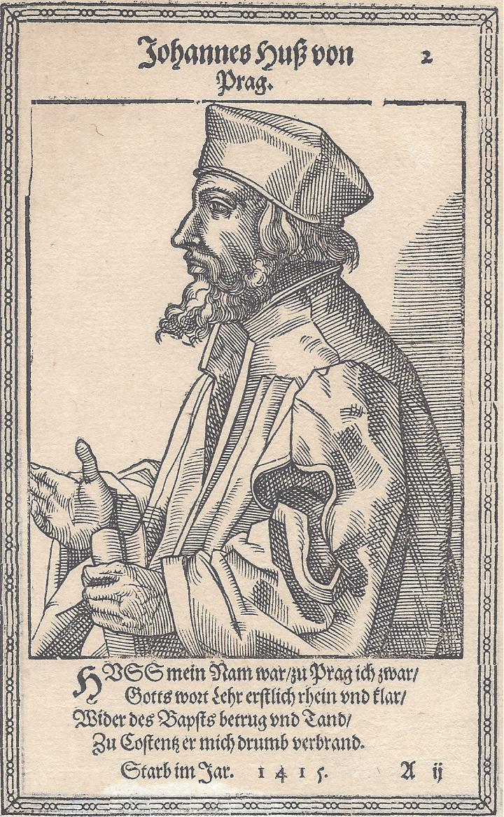
We have already mentioned Hus’s dot accent, which survives in Polish ż.
The history of the dot on the i (and the j, which is a modified version of the i) is different. This dot is called a tittle and it was introduced in medieval writing to distinguish the vertical stroke representing ı from those representing n, m, or u: minimum is easier to read than mınımum. Note that there is no tittle on the capital I, because that character is more easily distinguished from others around it (MINIMUM). Since the tittle on lower case i and j is always present and does not distinguish letters from each other, it is, strictly speaking, not a diacritic. However, it is removed before some other diacritic is inserted on top of an i (í, ï, ī, ĭ, ì; note the difference between í and í, for example — but then again your device may have been smart enough to take the tittle off the second character, which is an i and a combining acute accent) though not, when a diacritic is added elsewhere: į, i̯, ɨ, etc.
When Turkish started to be written with the Roman alphabet in the late 1920s, it adopted i, ü, u for three of its high vowels, but it needed a letter for the fourth, the back unrounded high vowel, [ɯ], too. Y was used for [j], so a dotless ı was selected for the job. Accordingly, in Turkish spelling i and ı, as well as their capital versions, İ and I, are different letters (cf. İzmir vs. Iğdır). Here the tittle is really a diacritic mark.
In Lithuanian words we can also find this diacritic on ė [eː], which is different in quality from ę [ɛː].
The ring diacritic is most commonly encountered on å in some Scandinavian spellings, where it is often replaceable by aa, and on ů in Czech, where it represents the [u] historically coming from an [o] (like Polish ó).
For example, the name of the Danish city Aarhus is at the very beginning of an alphabetical list, but earlier, when it was spelt Århus, it was at the very end (at least in a list ordered the Danish way: a, b, c, … x, y, z, æ, ø, å).
The cedilla first appeared under the letter c. In fact, ç was originally not a c with a diacritic, but a survival of the Visigothic z, which looks like this: ꝣ. (If you don’t see this charcter, check the last item in the stylish Visigothic alphabet shown below. Also note the absence of the tittle on i.)

Cedilla itself means ‘little zed’. So etymologically ç is a single character without a diacritic which has nothing to do with the letter c. As such it belongs to category 2 above. However, it was reinterpreded as a diacritically marked variant of c.
It was adopted in Spanish for the affricate [ts], but later both the affricate and the character itself was lost in Spanish. It survives in Portuguese, Catalan, or French spelling, and represents [s]. For example, Barcelona contains [s], but in the name of the football club, Barça, the letter c is followed by a, so it would be rendered as [k], therefore it is spelled ç to retain the original [s]. Similarly, when a c, which also represents [s] before e and i in French, finds itself before a, o, or u, it is replaced by ç: recevoir~reçoit~reçu ‘to receive, he receives, received’.
The diacritic is also used with s in Turkish spelling: ş is [ʃ] (e.g., in paşa), ç is [tʃ] (e.g, çek ‘cheque’).
The comma diacritic looks so similar to the cedilla that the two are often confused (especially since they may look identical in a sans serif font). The comma diacritic is used in Rumanian spelling: ș is [ʃ], ț is [ts]. Compare the spelling of the Rumanian name of the town Timișoara with Turkish Temeşvar (Hungarian Temesvár). (You may have to zoom in to see the difference.)
Latvian spelling makes extensive use of this diacritic to mark palatalization: ģ, ķ, ļ, ņ. Note that the comma is placed above g, which has a descender (extends below the baseline). This usage is similar to that of the caron.
In Polish, ogonek means ‘little tail’, the Lithuanian name, nosinė ‘nasal’, does not reflect its shape, but its (former) function. The vowels bearing this diacritic were nasalized earlier. In Lithuanian this nasalization is lost, so ą, ę, į, ǫ, ų represent long vowels. Polish only has this diacritic in ą and ę, and here many speakers retain the nasalization. The Nobel laureate Lech Wałęsa’s name, for example, is pronounced [vawɛ̃sa]. Ą is not [ã] as expected, but [ɔ̃]: Śląsk [ɕlɔ̃sk] ‘Silesia’.
The tilde is probably familiar from Spanish writing. The name itself comes from the same Latin word as tittle (and also title), and it means something ‘written above’.
In medieval script the tilde was used to mark omission of letters (much like the apostrophe is today). For example, Latin domina ‘lady’ could have been written as doña, which happens to be the spelt form of the Spanish word [doɲa] ‘lady’. In Spanish itself, the tilde is only used with n (España, español), while in Portuguese it is found on a and o, and represents the nasality of these vowels. The local name of the leader of the first band to circumnavigate the Earth, Ferdinand Magellan, is Fernão de Magalhães. This usage of the tilde as a nasalization mark is adopted by the IPA, too.
The ‘omission of letters’ interpretation of the tilde survives in the current practice of dictionaries, where it is used as a substitute of the entry: virus, pl. ~es or viri.
While the above diacritics rarely touch the letters they are added to, the bar or slash to be discussed lastly runs across its host. Some better-known examples are the Polish ł representing [w], of which we already had examples like Łódź or Wałęsa (this is like the English l in, for example, milk, in the speech of many younger speakers); the Danish and Norwegian ø, where Swedish or German have ö (notice that [ø] is also the IPA symbol for this vowel); or the Icelandic ð/Đ or Serbocroatian đ/Đ (again, the Icelandic sound value is IPA [ð], but in Serbocroatian, it is [dʑ]). Notice that the lower case versions of Đ look different in Icelandic and Serbocroatian.
This diacritic is also common in currency signs: $, ¢, ₤, ¥, €, etc.
* * *
The above discussion is only an illustration of some of the most important diacritic marks used with the Roman alphabet. If you crave for more details, visit the links provided above or visit diacritics.typo.cz. If you read Hungarian, you may also read this series on diacritics: part 1, part 2, part 3, part 4.
Some of the diacritic symbols above originate from a letter. The umlaut, for example, is a stylized e, since it is the digraph oe that developed in to ö, as we have seen above. In other cases, oe merged into one symbol where the two letters are still distinguishable: œ. This is a ligature. (Thus, etymologically an umlauted vowel letter is a ligature, while dieresis is a diacritic symbol, despite their identical looks.)
We can distinguish between two kinds of ligature. Πis a character ligature, these two letters occured next to each other so often, that they blended into a single character. Stylistic ligatures are often not even noticed by typographically insensitive readers. If you carefully compare fi and fi, you can see that the first one is a single unit, the f and the i have melted into each other, in fact, the tittle of the latter is missing and substituted by the ascender of the f.
Some character ligatures are still clearly identifiable, their components are obvious. So it should not be surprising that æ or œ are composed of an a/o plus an e. Also the affricates [tʃ], [ts], [dʒ], [dz] were earlier represented by ligature symbols, [ʧ], [ʦ], [ʤ], [ʣ], in the IPA.
The source of other character ligatures is less obvious. The ampersand, &, for example, comes from the combination of an E and a t (since Latin et is ‘and’): ![]() . In the case of W, the name double U (or in many other languages ‘double V’) is telling (remember, there was no difference between U and V until recently). The Dutch ligature ÿ was mentioned above. The German letter ß is also a character ligature, it is the conflation of the digraphs sz and ss, both written with the “long” S, ſ and either the “tailed” Z, ʒ, or the “round” S, s. One name of this ligature is Eszett ‘S Z’, the other is scharfes S ‘sharp S’. This road sign shows the two letters separately.
. In the case of W, the name double U (or in many other languages ‘double V’) is telling (remember, there was no difference between U and V until recently). The Dutch ligature ÿ was mentioned above. The German letter ß is also a character ligature, it is the conflation of the digraphs sz and ss, both written with the “long” S, ſ and either the “tailed” Z, ʒ, or the “round” S, s. One name of this ligature is Eszett ‘S Z’, the other is scharfes S ‘sharp S’. This road sign shows the two letters separately.
The parts of a stylistic ligature form one unit only technically, that is, they were carved on one piece of lead, and they have one code assigned to them in computers, but otherwise they are still two independent characters. The reason for their existence is purely esthetic: they avoid the “collision” or close proximity of glyphs, which is considered ugly. In a ligature such letter pairs or triplet are merged into one glyph.
Good typesetting systems and fonts take care of stylistic ligatures automatically. Above I have just typed an f and an i, and this (hopefully) produced the ligature fi on your screen. To avoid the merger of the two letters,
The most common set of stylistic ligatures in a modern font is this quintet:
fi ff ffi fl ffl, cf. their nonligature versions:
But other letter combinations may also be rendered by a stylistic ligature in some fonts, for example, ft fj ct st. (As you can see, this is not the case in the font of this text.)
Some authorities claim that a stylistic ligature should not span across a morpheme boundary. So while shellfish is typeset with a fi ligature,
Recall, that Turkish spelling distinguishes between i and ı. This means that it is not appropriate to use the fi stylistic ligature in Turkish texts, since it is barely distinguishable from fı.